About Aspect-ratios
The widescreen aspect ratio is so widely used it’s hard to imagine movies have ever been presented in another form. Movie-theaters have projected film in widescreen for decades, with very few exceptions. Maybe television has honored the square aspect-ratio for a while longer, at least until the mid nineties, but even TV is widescreen all around us these days.
Of course there are different widescreen-ratio’s used. 2.39:1 is a standard ratio these days, but 1.85:1 (a less wide variant, roughly equal to the 16×9 widescreen tv-ratio) is also used, more often in drama and small-scale productions. This choice is often made because true widescreen (the 2.39:1 ratio) is less easy to use for the presentation of close-ups and medium-shots in dialogs. If you want to fit a head in the frame, from chin to brow, you have to zoom out until that head at most fills about 1/3 of the image. So you get a lot of empty space. The less-wide aspect ratio’s reduce this effect, and in the classic 4:3 (almost square) ratio the same head would practically fill the entire screen.
Now, when you consider widescreen a certain slang of film-language, then filmmakers have become very adept at talking that slang and stepping over the pitfalls of the frame-size. Sergio Leone famously chose to go to extreme close ups for his dramatic western-standoffs, where he would literally cut off most of the upper- and lower-head, and just capture the eyes and the nose. That way, the entire wide frame was filled with the face of the actor.
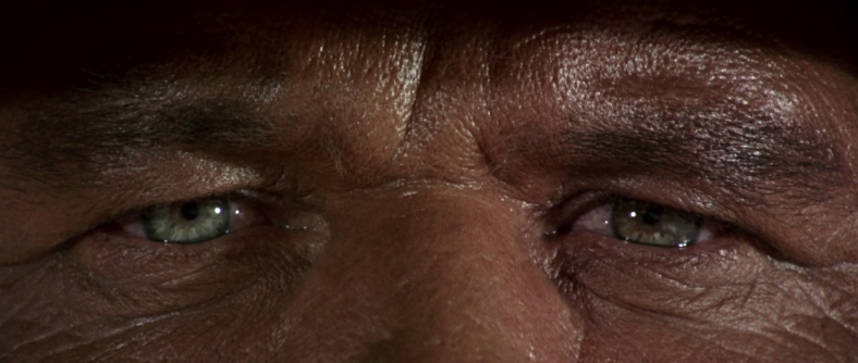
Sergio Leone famously filmed extreme close ups to fill the entire frame with just the face; thereby cutting off most of the head.
And, of course, it gave cinematographer’s that great tool of using over-the-shoulder reaction shots in dialogue scenes. In widescreen you can easily place a character in your frame from the chest-up and still have room to place the shoulders and/or head of the opposite actor in the foreground, something that would feel a lot more cramped in the older square ratio’s. Thus the viewer become much more aware at all times of the placement and location of the actors in the scene.
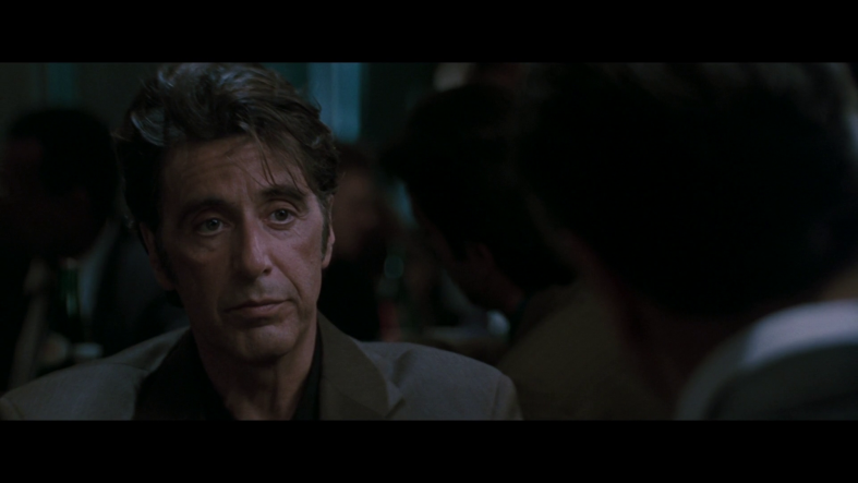
This dialogue between Al Pacino and Robert de Niro in Heat (1995) was filmed almost exclusively with over the shoulder shots.
All this being said; It’s still kind of fascinating that cinema has become so dominated by one single frame-size. When you look at paintings and photography you see a much more diverse usage of aspect-ratio’s. A square photograph doesn’t look retro per-se and (semi)square, or tilted widescreen, are still the most popular ratios for portraiture.
Of course, the problem is that films have to be presented to its viewer via screens. TV-screens, computer screens, home projectors and full-size theater projectors. Because each of those screens is an investment and exists independently from the content that is projected unto them, they decide the framing. Cinema’s have a very limited ability to adapt to different aspect ratio’s (they often can switch between 1.85:1 and 2.39:1 by pushing in the sides of the screen), but televisions or computers don’t. So you end up with a frame that is solid, fixed, and needs to fit the most popular usages.
And this works both ways. The frames of TV’s, theaters and computers have mostly settled on 16×9 (equal to 1.85:1) or 2.39:1 and thus most films have adopted that aspect-ratio. It’s like the chicken and the egg. They exist because of each other.
The Grand Budapest Hotel
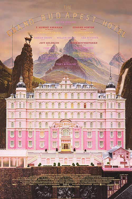
So when Wes Anderson released his latest film The Grand Budapest Hotel (2014) and used the 4:3 ratio for most of the story, I was pleasantly surprised. Especially considering the sizable budget ($31 million) and mainstream appeal, it seemed quite a gamble to present a square movie in the thousands of widescreen cinema’s worldwide. But not only did the movie became a critical and commercial success (the biggest hit of Wes Anderson yet), to my eyes it was his most beautifully filmed movie yet. I was literally stunned at how gorgeous the cinematography of Robert Yeoman looked in it’s square format, how the compositions looked perfect and everything ‘clicked’. It really opened my eyes again to the 4:3 square format and suggested that maybe its usage is still relevant…
The beauty of the cinematography on the film lies in the synergy of dozens of different elements. As has become a trademark of Wes Anderson, his movies are designed with utmost precision, down to the smallest detail. The camera is steady, fluid, always on tripods or rails, no movement is unmotivated. The compositions constantly feel like careful constructions, as if they are designed as classical paintings in the sense that every actor, every extra, every prop is carefully placed and thought-over. Reality in Wes Anderson films is designed in every way. Nothing is accidental or even spontaneous. It feels like a construction, a performance, a theater-play in a way.
And nowhere is this more apparent than in The Grand Budapest Hotel. Here, Yeoman and Anderson use every trick in the book to suggest that theatrical reality. Miniature sets, perfectly styled design and a very unique style of cinematography.
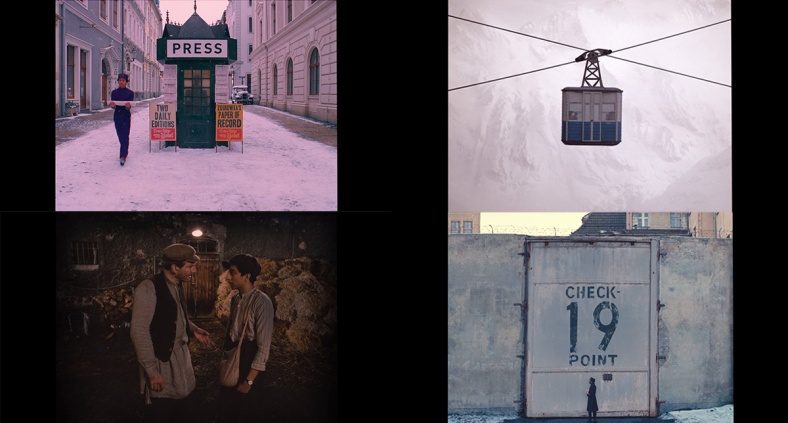
Cinematographically, the movie is composed along very strict lines and axes. It’s as if the camera never leaves a sort of 90-degree grid. We see the shots either framed head-on, or 90-degrees sideways. There are no diagonals, certainly no dutch angles, everything is aligned straight angles. In that sense, the camera-placement is complementary to the aspect-ratio, which is no coincidence to me. There is an angular quality to the movie wherein everything is in balance.
This style becomes quite intriguing when we watch two-person dialogue scenes, which are generally filmed in a slightly diagonal style (over-the shoulder etc.) Here we don’t get that familiar style. Instead, we see 3 perspectives, angled at 90 degrees. The line-of-sight becomes head-on and we literally see the characters staring into the camera-lens. That’s a kind of fourth-wall breaking effect, but in never jumps out at the viewer like that because it’s so well integrated into the overall style, a style that doesn’t suggest reality anyway.
The One Shot
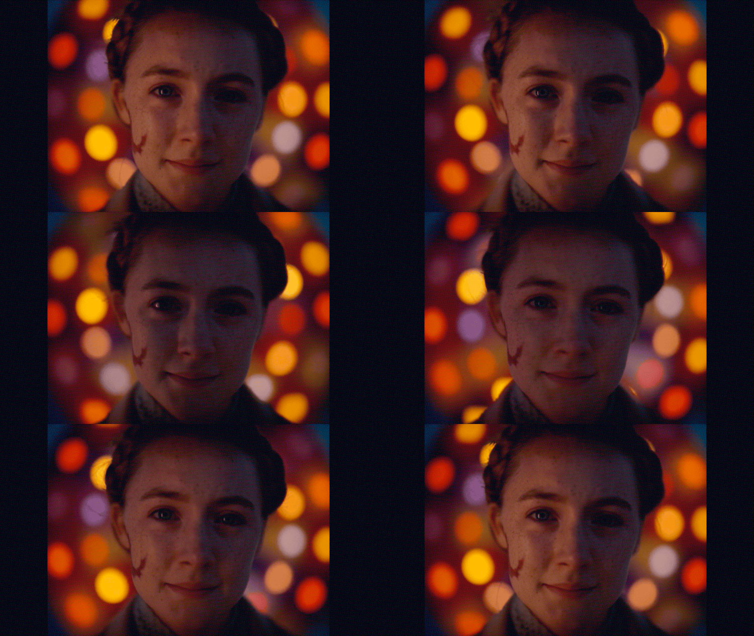
Now this head-on camera perspective Anderson uses throughout the film works magically in one specific shot. When lobby boy Zero (Tony Revolori) confesses his love to Agatha (Saoirse Ronan) at a carrousel, we see their whole exchange filmed for a side-angle as they ride the carrousel, until the moment where Agatha stops reading Zero’s letter and just stares at him. Right there the camera cuts to a head-on perspective, a point of view from Zero to Agatha. And we get a gorgeous shot that perfectly embodies the beauty of love.
Now this shot works on many levels. I love the perspective we have as a viewer, how Agatha literally looks us in the eyes. But equally as powerful is the way Yeoman chose to light the shot. The beautiful glow of the carrousel lights half of Agatha’s face in a continuous cycle, and quite surreally, Agatha has been given a halo of rotating lights behind her.
Those lights are of course relatable to the carrousel lightning, and they motivate the changing light on her face, but they don’t seem to literally be there in the reality of the scene. But this is what works so well in Wes Anderson movies; because of their magical realism these kinds of shots don’t jump out at the audience, they feel at place in their context. Anderson carefully constructs a certain tone of reality in which these shots nestle comfortably. The only thing that the audience notices is the beauty of the composition.
And finally, that’s the third quality of this specific shot; it’s 4:3 aspect ratio. It’s in this shot that we really see the beauty of the 4:3 ratio when it comes to portraits. Agatha is perfectly centered in the frame and her entire face is captured within the frame, and there is just enough space on the sides for the background lightning. It feels perfectly balanced as a portrait. Had it been shot in widescreen it would either have cut off part of Agatha’s face or do something with the extra space on the sides (now simply blacked out).
Most importantly, this shot creates a kind of vortex of attention because of the circling lights. It’s almost like a hypnosis-shot where the audience falls into a trance just staring at it. That works so well because the circle of lights fits well within the semi-square aspect-ratio. The entire background thus consists of rotating lights. Widescreen, especially the 2.39:1 ratio, would lose that overlap between the circle of lights and the frame of film.
The Grand Budapest Hotel in its entirety is a testament to the power of the 4:3 aspect ratio, and almost every shot demonstrates the characteristics of the ratio in creating unique compositions, which would not have worked as well in widescreen ratios. But this single shot has a unique beauty that surpasses all other shots because of its inventive lightning, it’s unique perspective and great composition. As Zero falls for Agatha, so have I fallen for this single shot.

Hello. About the shot itself, you do have an opinion about how the telephoto is pushed/ D.O.F. is thin? i mean just a kind of..